← All work

Styla: one platform, two businesses.

A booking platform where clients discover and book verified stylists, and barbers run their entire shop. Two products that had to feel like one.

Role
Product design, end to end
Scope
100+ screens, both sides of the marketplace
Platform
Mobile app + web presence
Tools
Figma, token-based system
01 / The problem

Barbers run real businesses on DMs and paper calendars.

Independent barbers and salons juggle bookings over Instagram DMs, phone calls and walk-ins. No-shows cost them directly. Clients, on the other side, have no clean way to find a verified stylist, see honest ratings, and book without the back-and-forth.

Styla's bet: give clients a discovery and booking experience they trust, and give professionals their own storefront with the whole business behind it: bookings, payments, client management, staff scheduling.

Side one · Clients
Great hair starts here

Discover verified stylists nearby, compare ratings, book in three taps, manage everything on the go.

  • Search and discovery with verified profiles
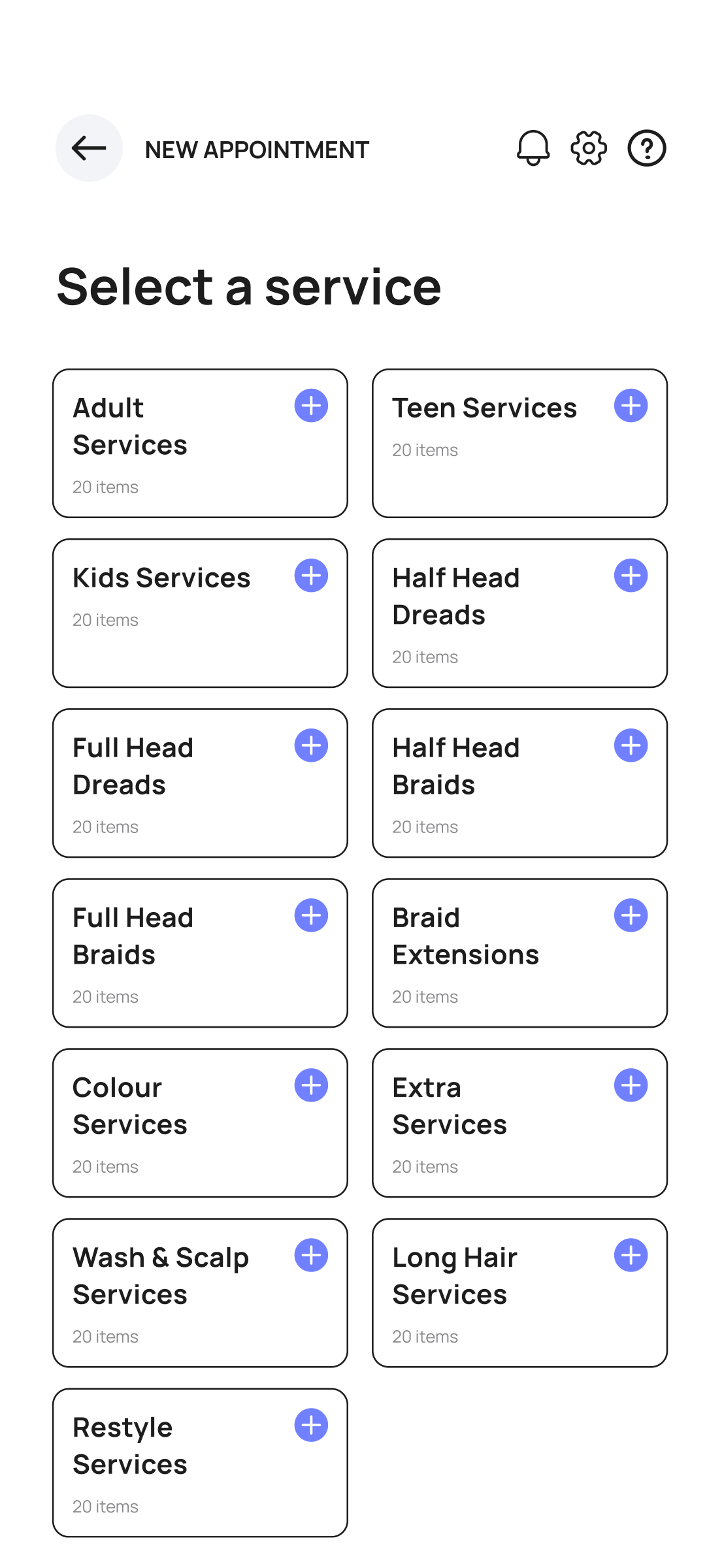
  • Service categories, add-ons, time selection
  • Secure bookings, recurring appointments
Side two · Professionals
Your chair. Your brand.

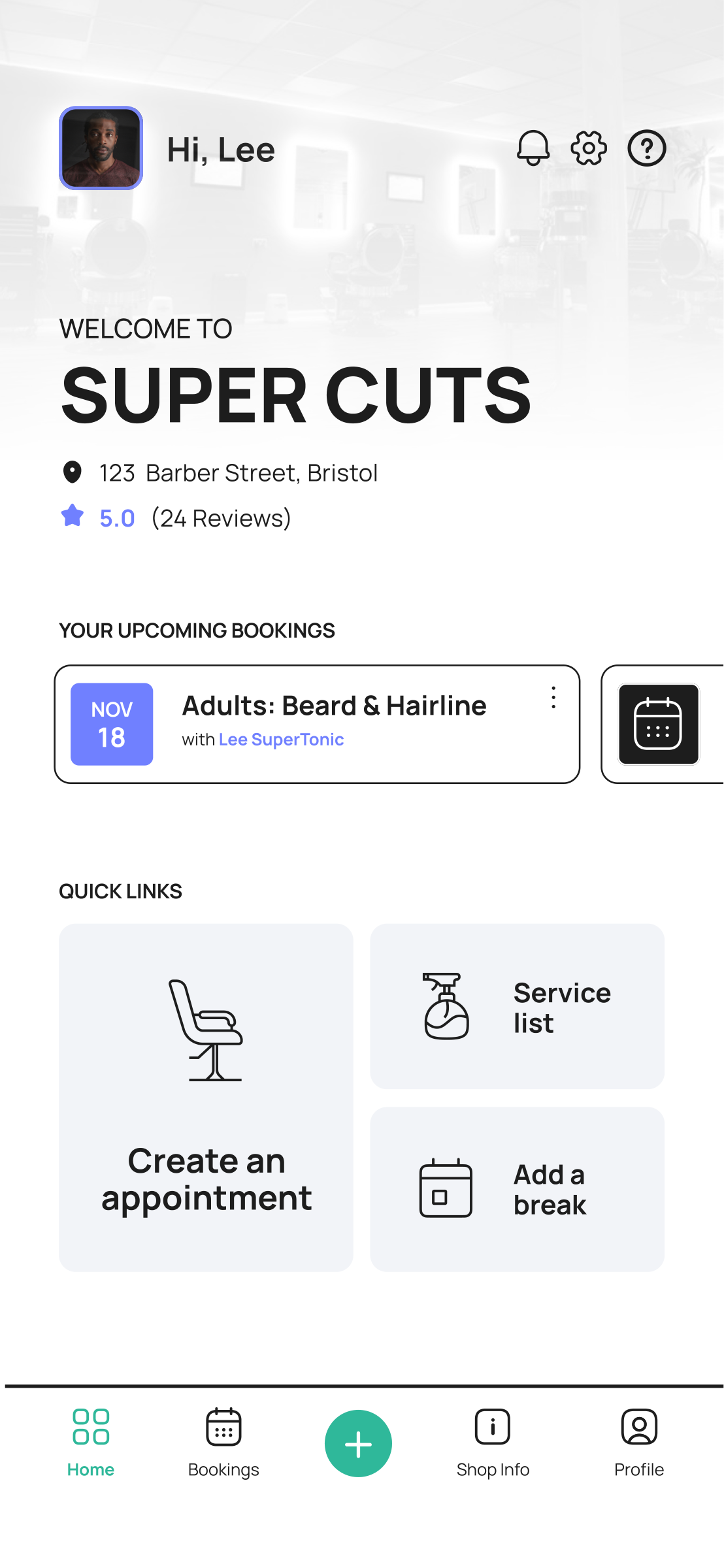
An online store plus the operations layer: intelligent scheduling that fights no-shows, and tools that replace the admin.

  • Calendar, shifts, time off, business hours
  • Staff and team management, client lists
  • Payments, posts, notifications, support
02 / Decisions

The calls that shaped it.

Two-sided products fail when one side gets treated as an afterthought. The design work was mostly about deciding where the two experiences share DNA and where they must diverge.

Design the professional side to full depth first.
Tradeoff: slower to a pretty consumer demo, but supply density is what makes a booking marketplace live or die. A barber who runs their whole shop in Styla never churns; a client app with no barbers is a dead app.
One token system, two expressions.
Tradeoff: building the shared component library up front cost roughly two weeks before screens started shipping. It paid back across 100+ screens: both apps stay consistent, and a change propagates once, not twice.
Booking is a three-step spine, everything else hangs off it.
Tradeoff: add-ons, recurring appointments and in-store payment options all pushed to attach themselves to the core flow. Each one earned its place only if it didn't add a step for the majority path.
03 / Try it

The booking spine, live.

The client booking flow, rebuilt as a working component. Three decisions, then confirm. The real app hangs add-ons, recurring bookings and payment choices off this spine without lengthening it.

Live rebuild

Book an appointment

Interactive reconstruction of the Styla booking flow. Not the production app.
1 · Service
2 · Barber
3 · Time
Confirm
04 / The professional side

A shop's whole day, in a pocket.

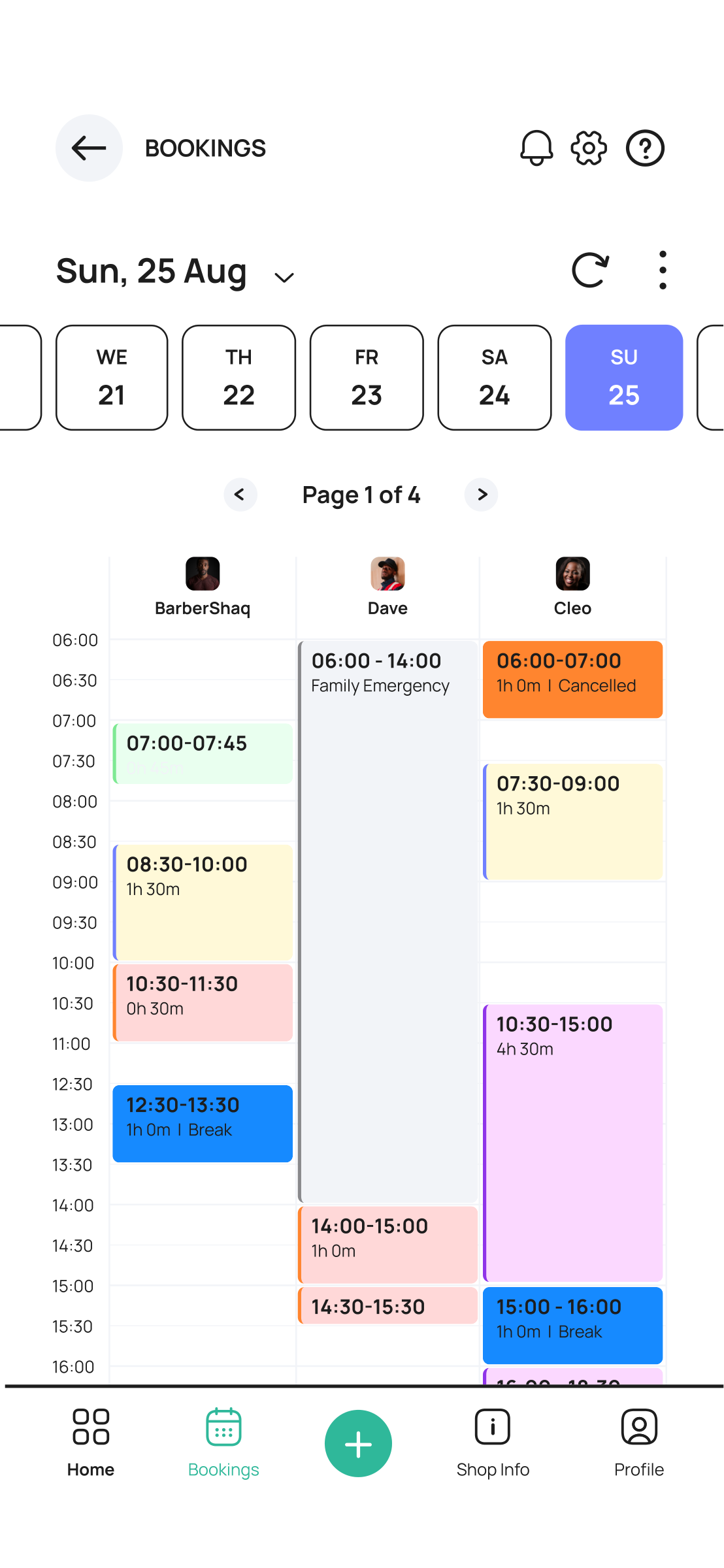
The barber side is where the depth lives: the day's schedule at a glance, appointment detail states before, during and after a cut, cancellations, edits, staff shifts, time off, business hours, client histories. Around 70 of the 100+ screens serve this side.

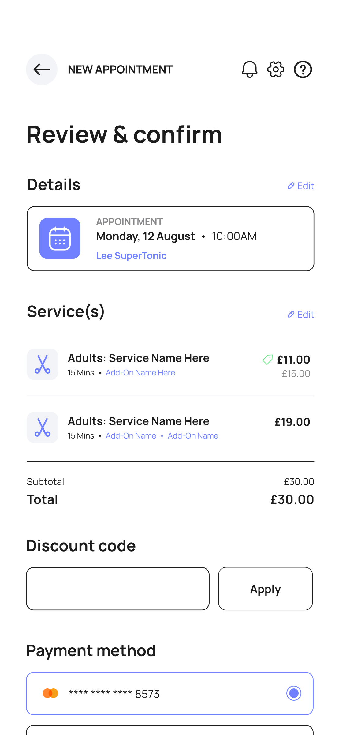
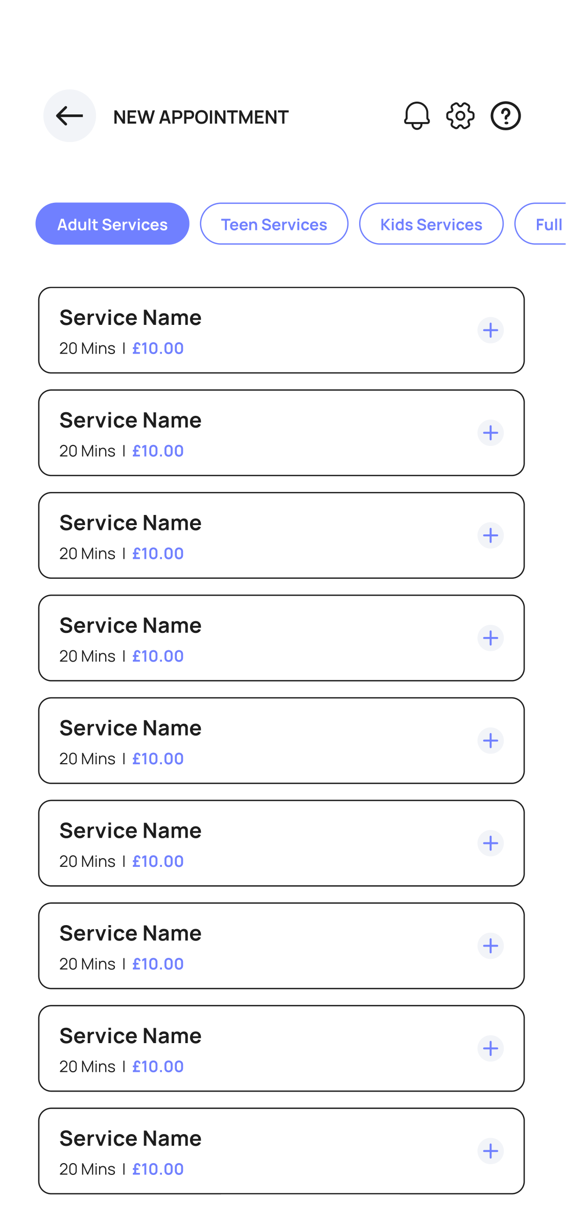
Styla barber dashboard Styla calendar Styla appointment creation Styla booking summary
05 / Craft

The client side stays out of the way.

Clients get the same visual language with the operational depth hidden. Categories, time selection and booking summary use the shared tokens, so a client who becomes a barber (it happens) recognizes the product instantly.

Styla service categories Styla booking summary

What I'd push next

  • Instrument the no-show rate against reminder cadence: the design assumes smart reminders reduce no-shows, that assumption deserves numbers.
  • Rebooking is the retention engine. A one-tap "same again" from the booking history should be the most prominent action for returning clients.
  • Waitlist mechanics for fully booked barbers: demand data the supply side can act on.
Next case study
Updone → keeping a marketplace's money where it belongs