← All work

Acre AI: making land comps legible.

A comping and funding platform for US real estate investors. Search a property, run comps against it, and model the funding, all in one place.

Role
Product design, end to end
Scope
Search, comping, funding, auth, mobile
Platform
Responsive web app
Tools
Figma
01 / The problem

Investors were comping land in spreadsheets and browser tabs.

Land investors judge a deal by comparing it to recent nearby sales. The workflow was scattered across listing sites, county records and manual spreadsheets. Slow, error prone, and impossible to do quickly on a phone while standing on a lot.

Acre needed to pull that whole judgment into one product: find the property, surface the comparable sales, and show whether the numbers work, without burying an investor in data they have to interpret themselves.
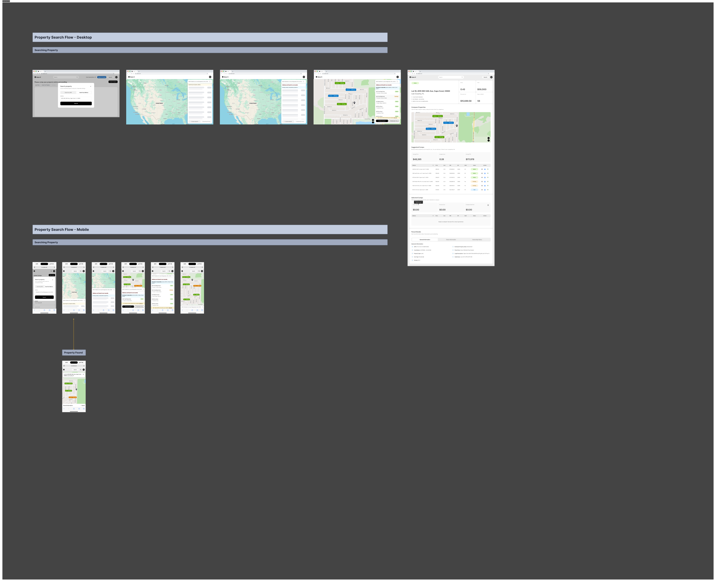
Acre AI property search flow map
The search and discovery flow, mapped before any screen was designed.
02 / The approach

Design the decision, not the database.

The core call I made: the interface should answer a question, not present a table. Every screen leads with the thing an investor actually decides on, and pushes the raw data one layer down for when they want to verify it.

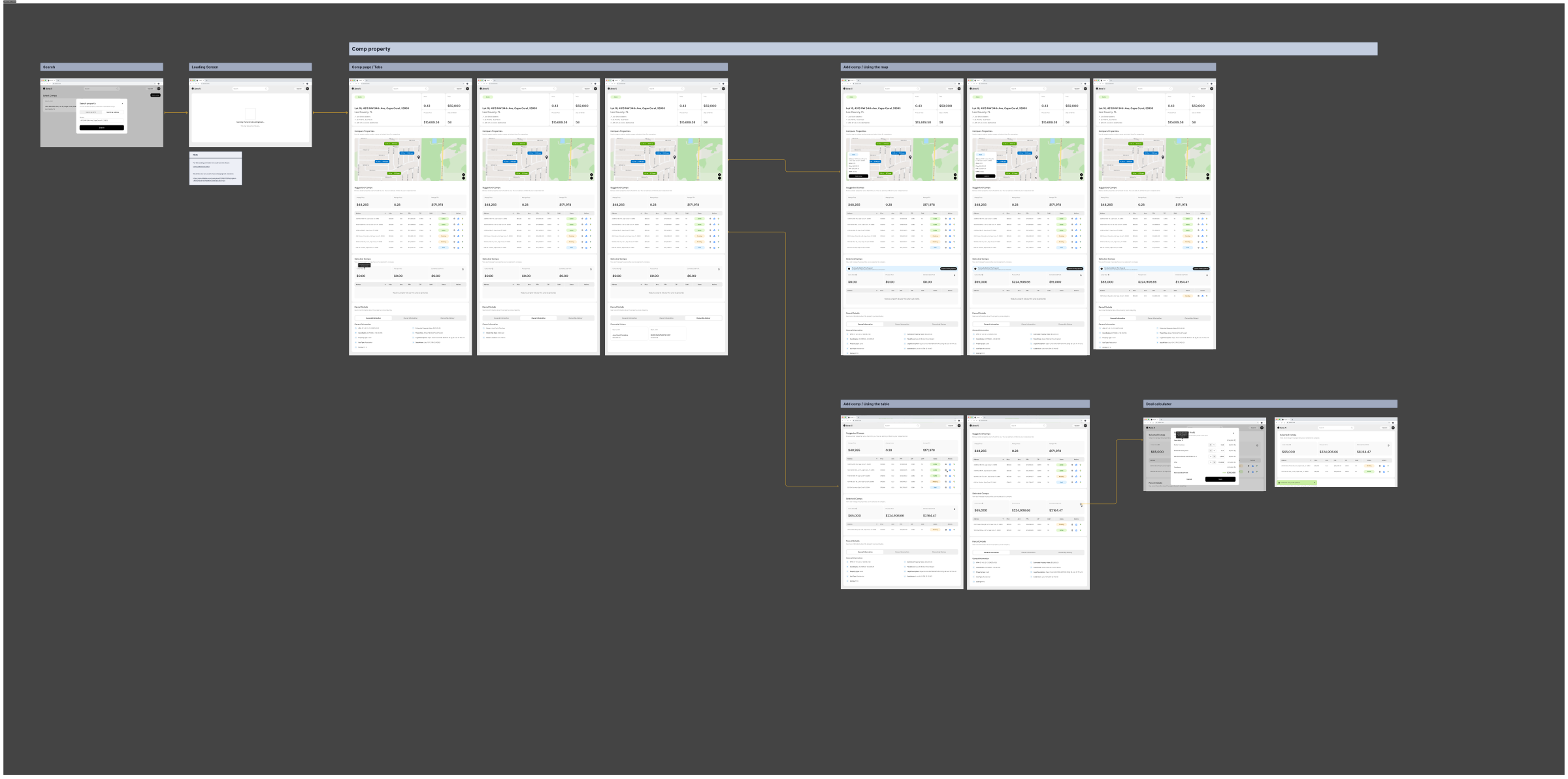
I designed the comping workflow so the comparison reads top to bottom like an argument. Subject property first, comps ranked by relevance, then the margin. The desktop version gives analysts room to dig; the mobile version compresses the same logic to a thumb-reachable summary.

Lead with the verdict, keep the evidence one layer down.
Tradeoff: a verdict-first UI risks over-trust in the model's comps. Mitigation: every comp is inspectable and removable, and the margin recalculates live, so the user can stress-test the recommendation instead of just accepting it.
One flow, two densities.
Tradeoff: maintaining a desktop analyst view and a field-ready mobile view doubles the state matrix. Cheaper than the alternative: a compromise layout that serves neither the desk session nor the person standing on the lot.
The calculator is the conversion moment, treat it like one.
Tradeoff: giving the funding calculator its own full screen adds a step to the flow. But it's the screen where a browser becomes a borrower, and burying it in a sidebar undersold the product's core promise.
Acre AI comping workflow, desktop
Full comping flow, desktop. Subject, comps, then the number.
03 / Try it

The funding math, rebuilt live.

This is the funding calculator's logic, rebuilt as a working component so you can feel the interaction rather than look at a flat screen. Drag the inputs. The margin and the go/no-go call update the way they do in the product.

Live rebuild

Deal calculator

Interactive reconstruction of the Acre funding flow. Not the production app.
$180,000
$110,000
$9,000
Projected margin$61,000
Margin on ARV33.9%
RecommendationStrong buy
04 / Craft

The calculator screen it came from.

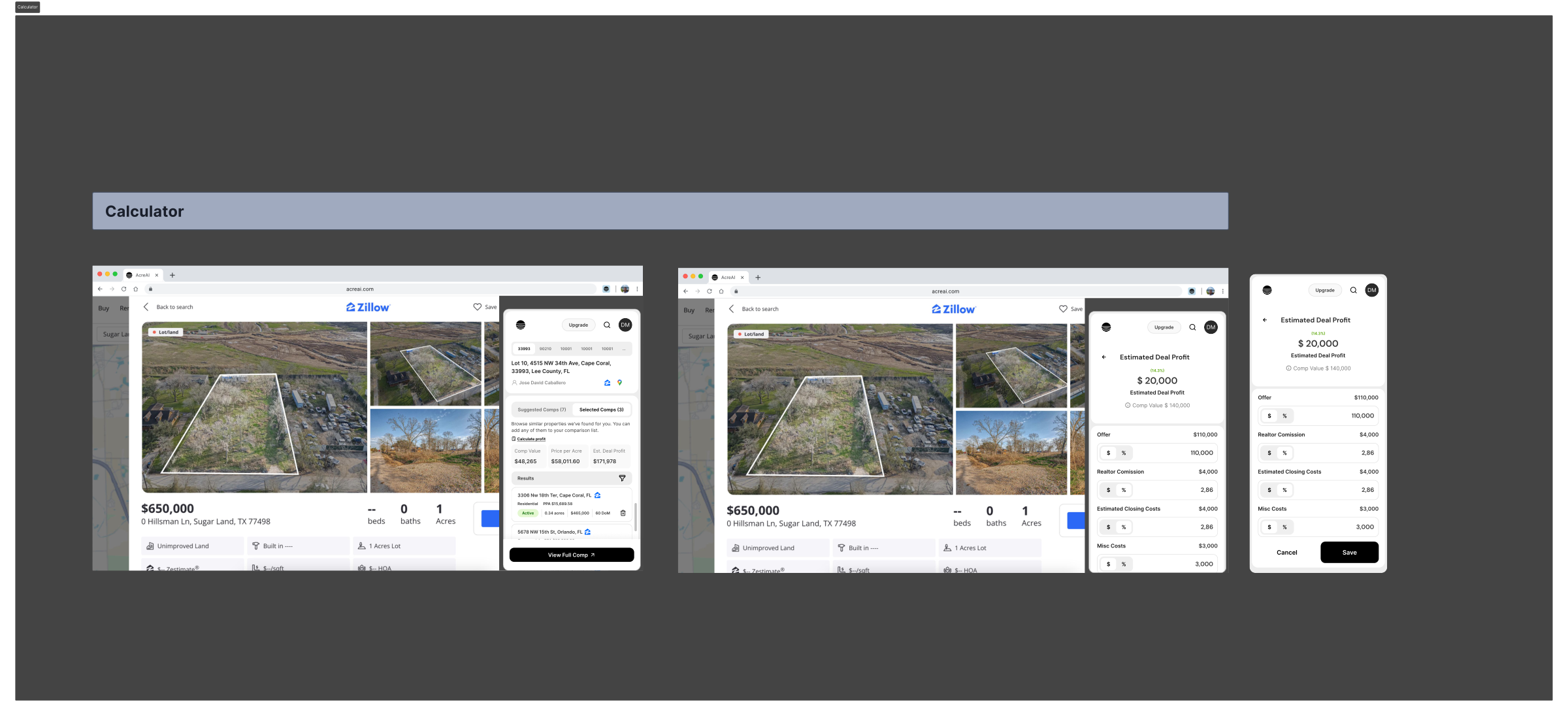
The production calculator handles the full funding picture: purchase, costs, funding source and the resulting position. I kept the visual weight on the outcome so an investor reads the verdict first and the inputs second.

Acre AI funding calculator UI
Funding calculator, production UI.
05 / Mobile

The same judgment, on a phone in the field.

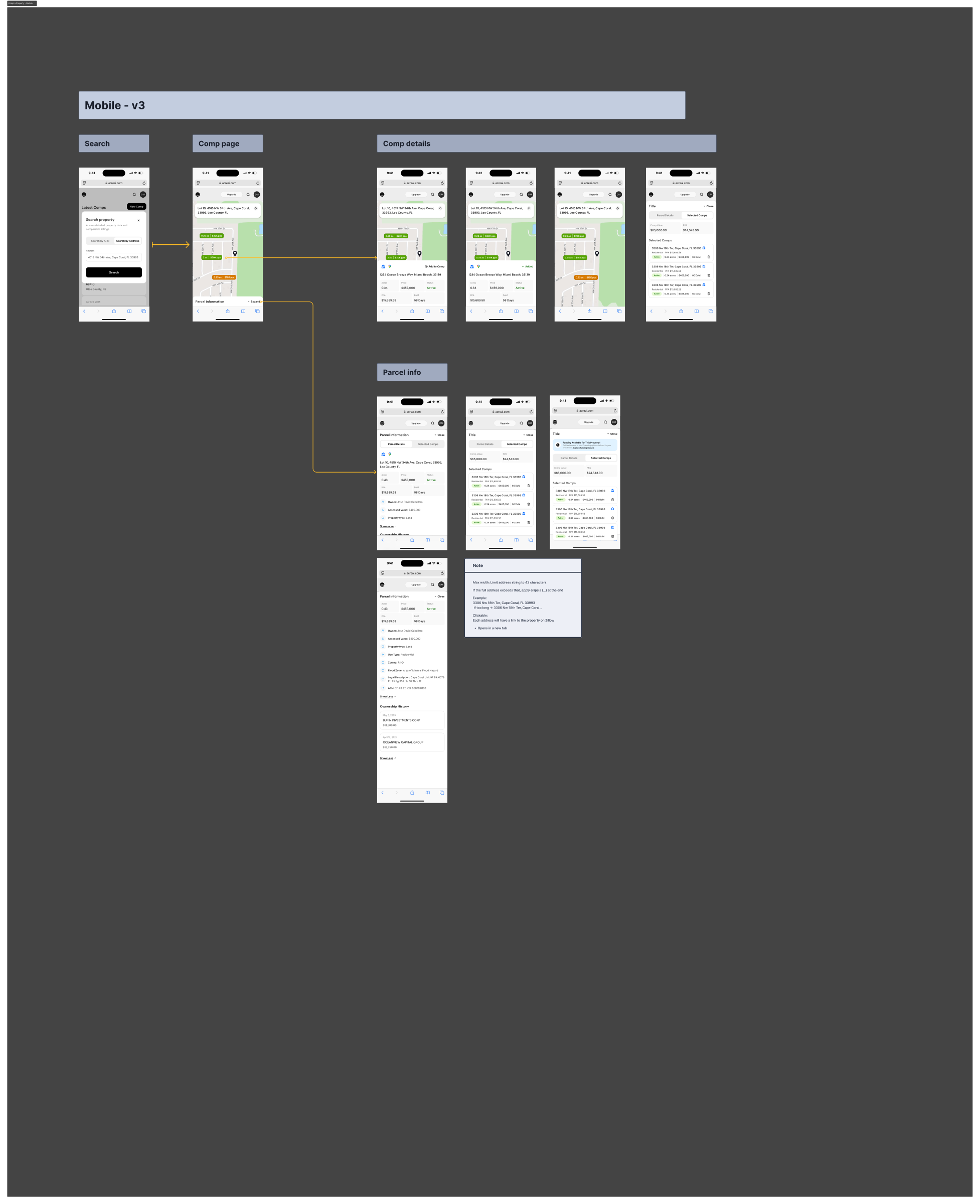
Investors evaluate lots on site. The mobile comping flow keeps the desktop's logic but strips it to what you can act on with one thumb: is this property worth pursuing, yes or no.

Acre AI comping flow, mobile
Mobile comping flow.

What I'd push next

  • Comp transparency: show why the model ranked each comparable where it did. Trust in the verdict is trust in the ranking.
  • Confidence states: a thin-data county should look different from a data-rich one, before the user commits money to the difference.
  • Field mode: offline-tolerant mobile summaries for lots with no signal, which is exactly where land investors stand.
Next case study
Styla → one platform, two businesses